Introduction
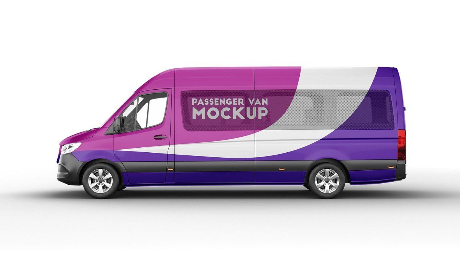
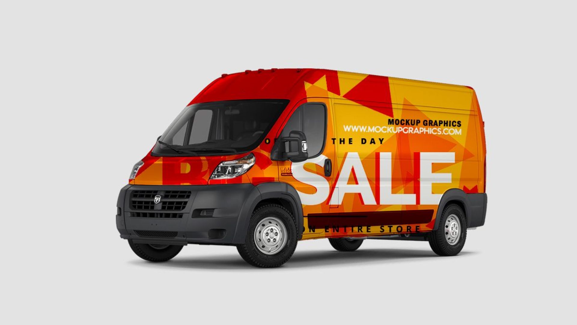
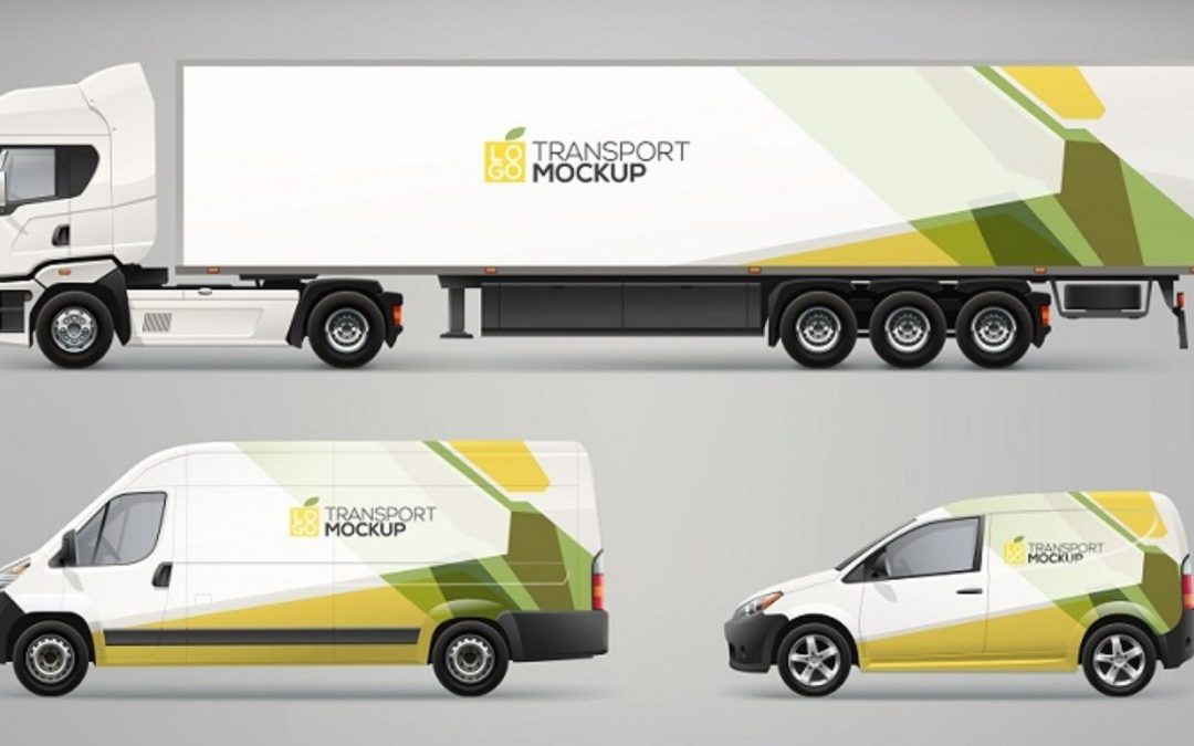
Vehicle graphics are a powerful marketing tool, turning ordinary vehicles into moving billboards that promote your brand or message. However, designing effective Vehicle Graphics requires careful consideration and attention to detail. Here are eight common mistakes to avoid to ensure your vehicle graphics are impactful and professional.

-
Overcomplicating the Design
One of the most frequent mistakes is overloading the vehicle graphic with too much information or overly complex visuals. While it might be tempting to showcase everything about your business, clutter can overwhelm viewers and dilute the message. Stick to a clean, simple design with a clear focal point, ensuring that the most important information stands out.
-
Ignoring the Vehicle’s Shape and Features
Every vehicle has unique contours, curves, and features that can affect how graphics are displayed. Ignoring these can result in distorted or obscured images. For example, placing text over door handles, fuel caps, or windows can lead to unreadable or partially hidden content. Always tailor your design to the specific vehicle model, taking into account its shape and dimensions.
-
Using Low-Quality Images and Fonts
The quality of images and fonts used in vehicle graphics is crucial. Low-resolution images and unprofessional fonts can make your vehicle look amateurish and untrustworthy. Always use high-resolution images and clear, legible fonts that are easy to read from a distance. Vector graphics are particularly useful as they scale without losing quality.
-
Poor Color Choices
Color plays a vital role in the effectiveness of vehicle graphics. Poor color choices, such as clashing colors or using colors that blend into the vehicle’s paint, can reduce readability and visual appeal. Ensure there is sufficient contrast between the text and background, and use colors that align with your brand identity. Testing your design in different lighting conditions can help you avoid color-related issues.
-
Neglecting Branding Consistency
Consistency in branding across all marketing materials is essential, and vehicle graphics are no exception. Inconsistent use of logos, colors, and fonts can confuse potential customers and weaken your brand identity. Ensure that your vehicle graphics align with your overall branding strategy, maintaining consistency in every element of the design.
-
Failing to Consider the Viewing Distance
Vehicle graphics are often seen from a distance and at various speeds. Small text or intricate details that might look good up-close can be difficult to read or understand from afar. Design with distance in mind, using large, bold fonts and clear, simple images that are easily recognizable from a distance.
-
Omitting Contact Information
While a striking design is important, it’s crucial not to forget the practical aspect of your vehicle graphics—providing a way for potential customers to contact you. Make sure your design includes essential contact information like phone numbers, websites, or social media handles, positioned prominently so they are easy to spot and remember.
-
Lack of Professional Installation
Even the best-designed vehicle graphics can fall short if not installed correctly. DIY installations can result in bubbles, wrinkles, or misaligned graphics, which not only look unprofessional but can also reduce the longevity of the wrap. Always invest in professional installation to ensure a smooth, durable finish that maintains the integrity of your design.

Conclusion
Vehicle graphics are a dynamic and cost-effective way to market your business, but their effectiveness hinges on thoughtful and strategic design. By avoiding these common mistakes, you can create eye-catching, professional graphics that enhance your brand’s visibility and impact. Remember to keep it simple, respect the vehicle’s features, use high-quality visuals, choose the right colors, maintain brand consistency, consider viewing distance, include essential contact information, and ensure professional installation. With these guidelines, your vehicle graphics can become a powerful mobile advertisement, driving your message forward wherever you go.

